There has been a long and wide-ranging discussion about UI spoofing in browsers (and of course Mozilla/Firefox in particular). Basically, bad-boy web content can pretend to be the location bar, the status bar, or other browser UI, and attempt to steal privacy information. The basic problem is covered in bug 22183. This is a problem that affects all browsers, since UI can be spoofed with simple images; however, it is easier in browsers that support XUL, since remote XUL tends to look the same as trusted browser XUL.
Gerv originally proposed a solution that always shows the status bar. This was deemed insufficient. The solution in place for Firefox 1.0 is to forbid untrusted websites from hiding the location bar (the URL bar). Here are the good reasons:
- Keeping the status bar open isn’t enough, because it is easy to push the status bar off the bottom of the screen (and hard to prevent).
- If you can see the location bar, it is pretty obvious what website you are visiting, and we make it even more obvious for secure sites by singling out the domain name from the certificate and displaying it prominently.
- The UI is discoverable. People use the URLbar all the time, they actually do get into the habit of looking at it. They know how to use it.
The disadvantages are not quite as obvious, and mainly have to do with enterprise applications: the location bar is large and can destroy the appearance of enterprise apps that open “dialog” windows and other small-UI windows. This is very important if Firefox is going to make inroads in corporate environments maintained by dedicated system engineers, and in many academic settings such as computer labs.
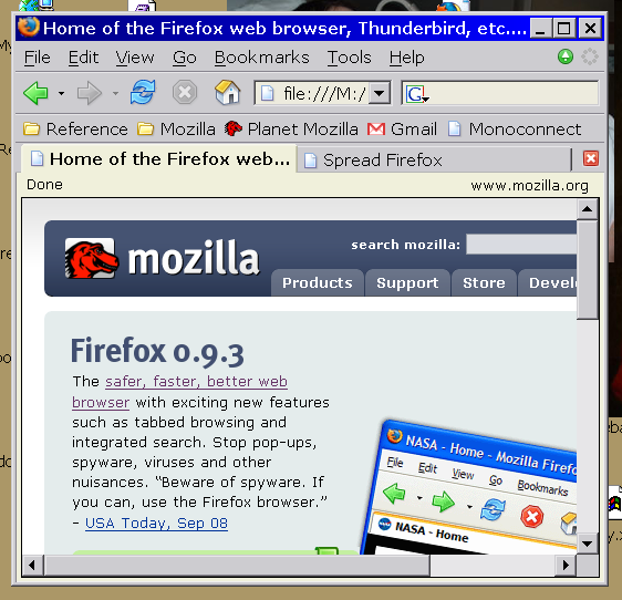
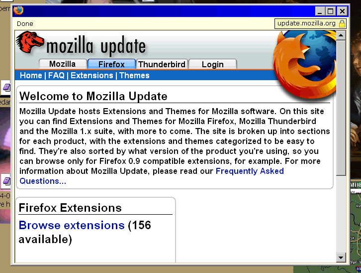
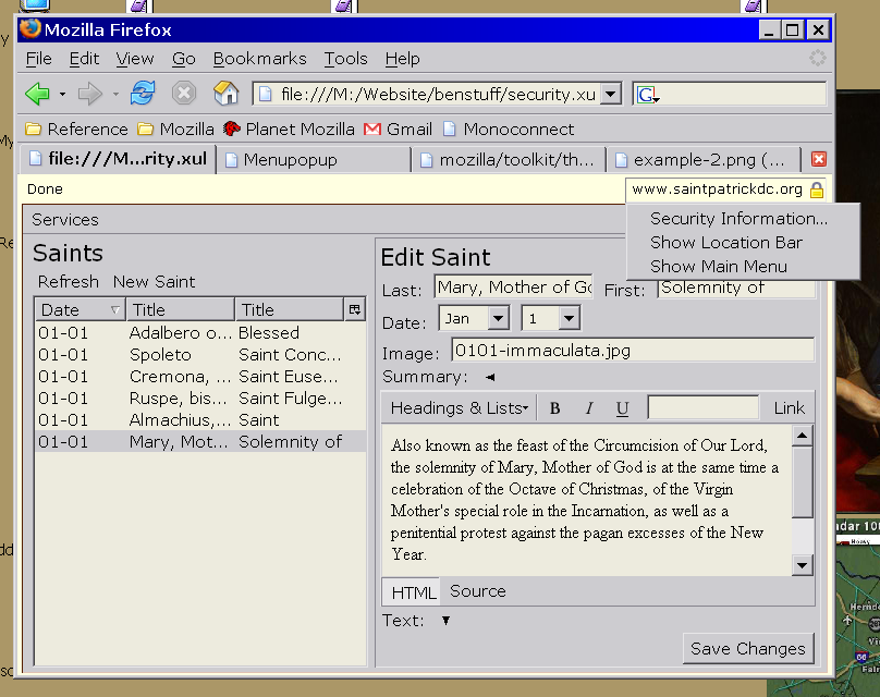
I have been thinking about this for a while, and read a lot of proposals, most of which were damn-ugly. But the core concept was good. Basically, the browser must delineate, obviously and discoverably on screen, between content from different security levels. It is not simply enough to say “the content below this line is untrusted” because you don’t know where the line ends. Instead, you need to wrap the untrusted content in a box, so that you know where it ends. Secondly, the UI has to be consistent. You can’t show one UI when it’s a chromeless window and a different UI when you add the chrome, or else users don’t know where to look for security information, and will not get accustomed to any solution. To this end, I have produced the following mockup images for your consideration:


The third example shows the problem with this approach. When you start adding back the browser chrome, it gets ugly quickly. The transition between the yellow and grey in the tab browser is harsh.

The status bar solution has all the problems listed above, but looks a lot better. Note that all of the status bar widgetry isn’t there, because this is a mockup. Use your imagination.


In combination with a tab browser, none of these solution are especially beautiful, at least yet. I’ll keep playing.
